
IDENTITY
LOCKUP
GUIDELINE
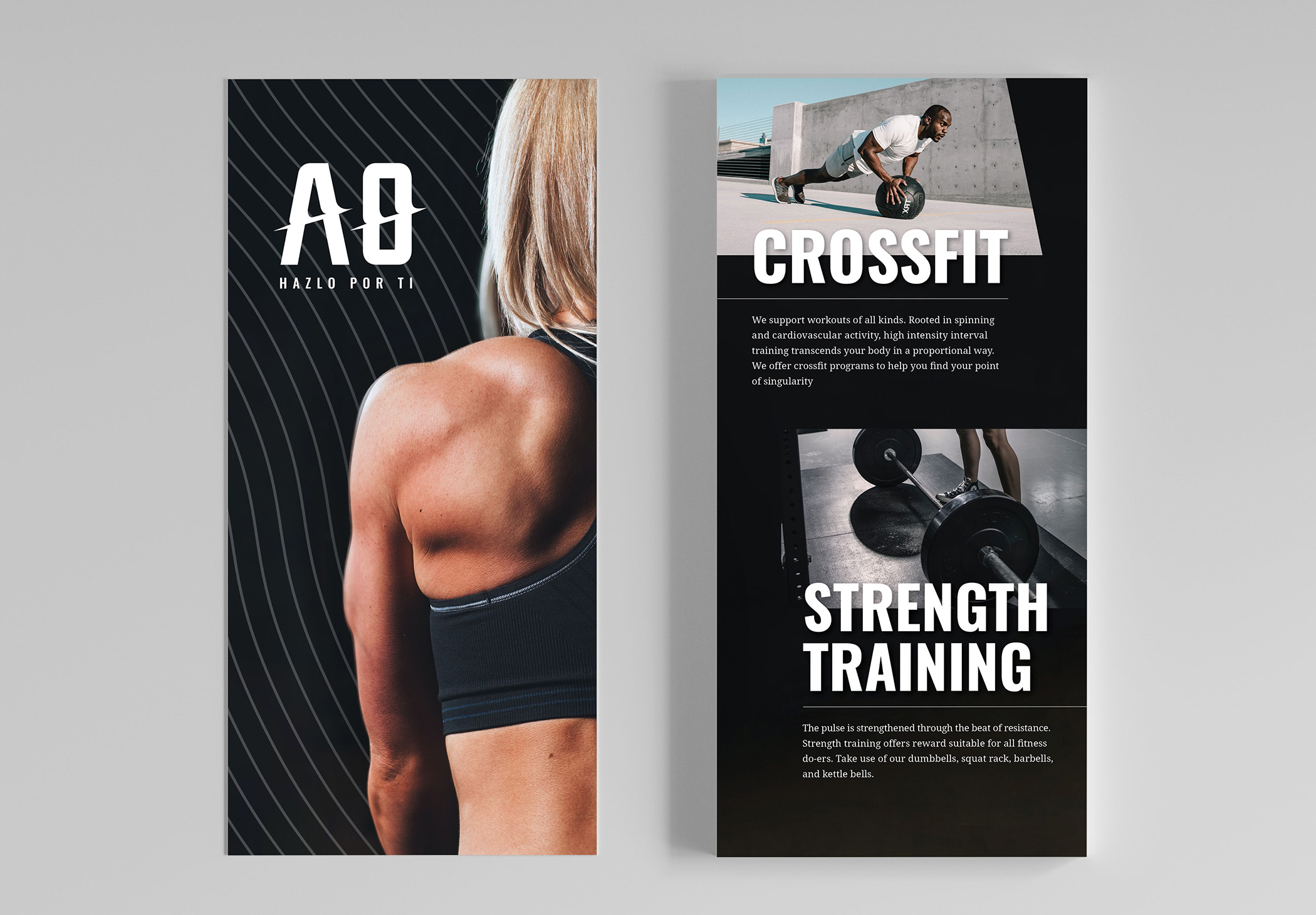
This gym is a safe haven for gym-goers of all types to transform their habits in order to be the healthiest versions of themselves. It doesn’t matter if you’re into crossfit, cardio, or strength training. All you need is will power to find your point of singularity.

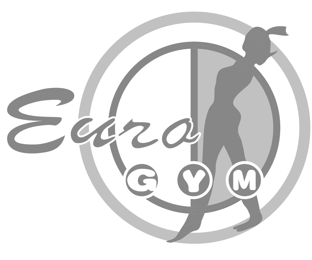
The typographic treatment within the logo echoes the extreme warping of matter and space from a black hole, referencing the modification of gym-goers' habits, while the logo’s silhouette reflects the primary audience.

Aero’s foundation lies in Michoacán, Mexico where it was first opened. The older logo was designed in the 90’s and was ready for a modern touch. This starting point required care and consideration, as the older logo's roots holds sentimental value.
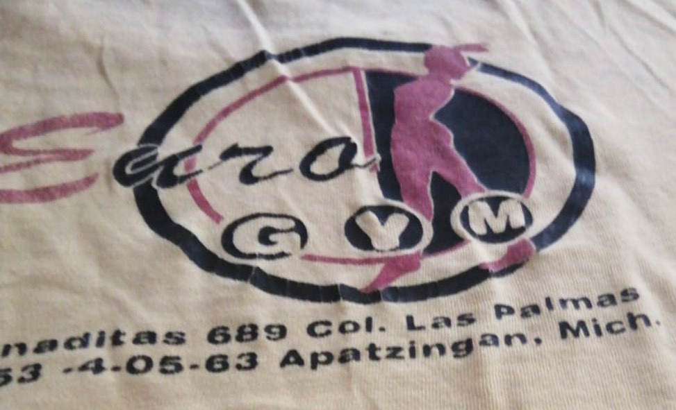
Old logo

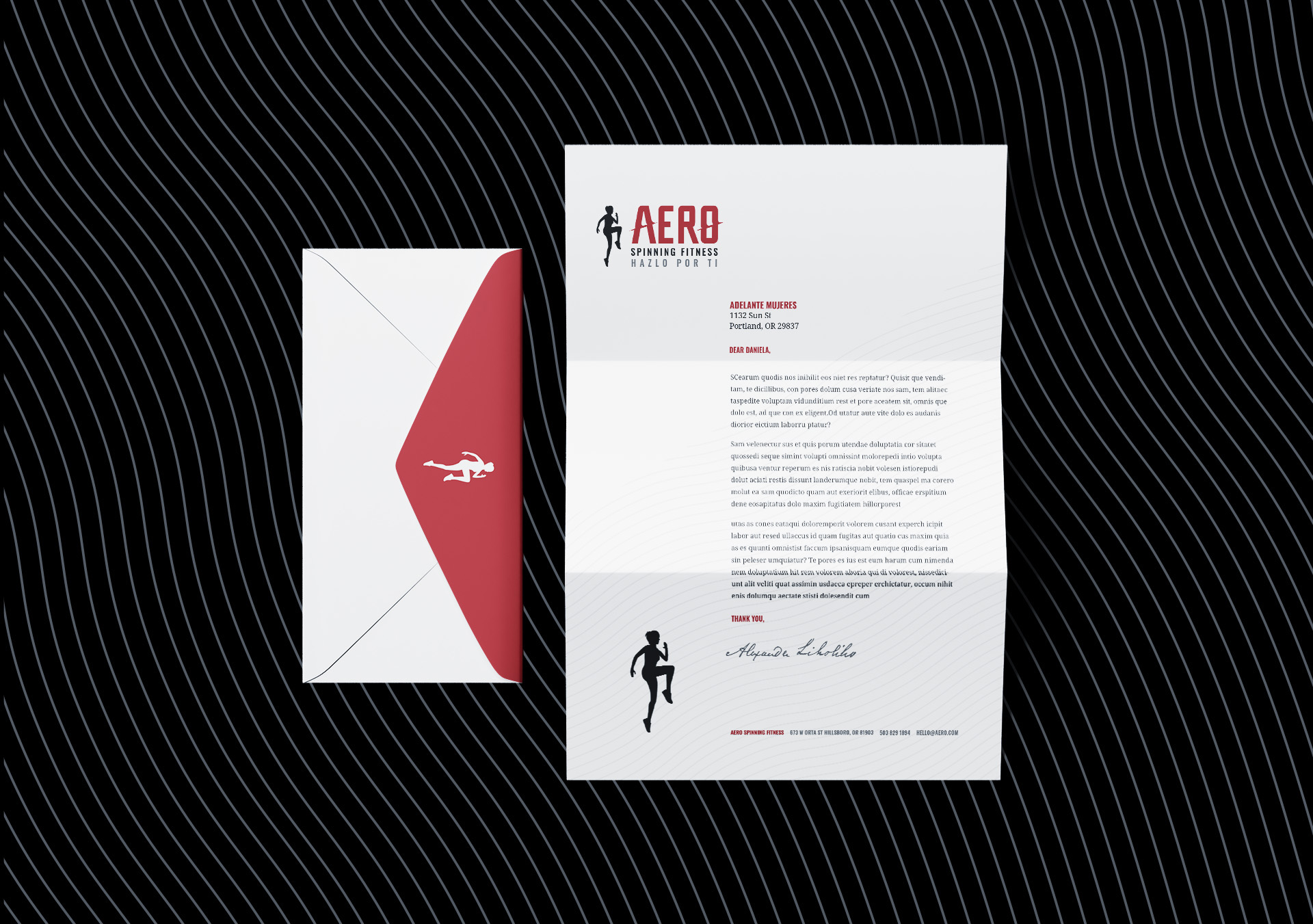
The multi-faceted nature of Aero is reflected within the brand's visual system. Most of the elements within the logo can be used alone, or taken off. This works well for merch that people can wear as a reminder of their progress.
The logo’s tagline is grounded with a humble foudation, meaning: “Do It for You”. Reminding gym-goers that fitness isn’t a popularity contest, it's personal progress.

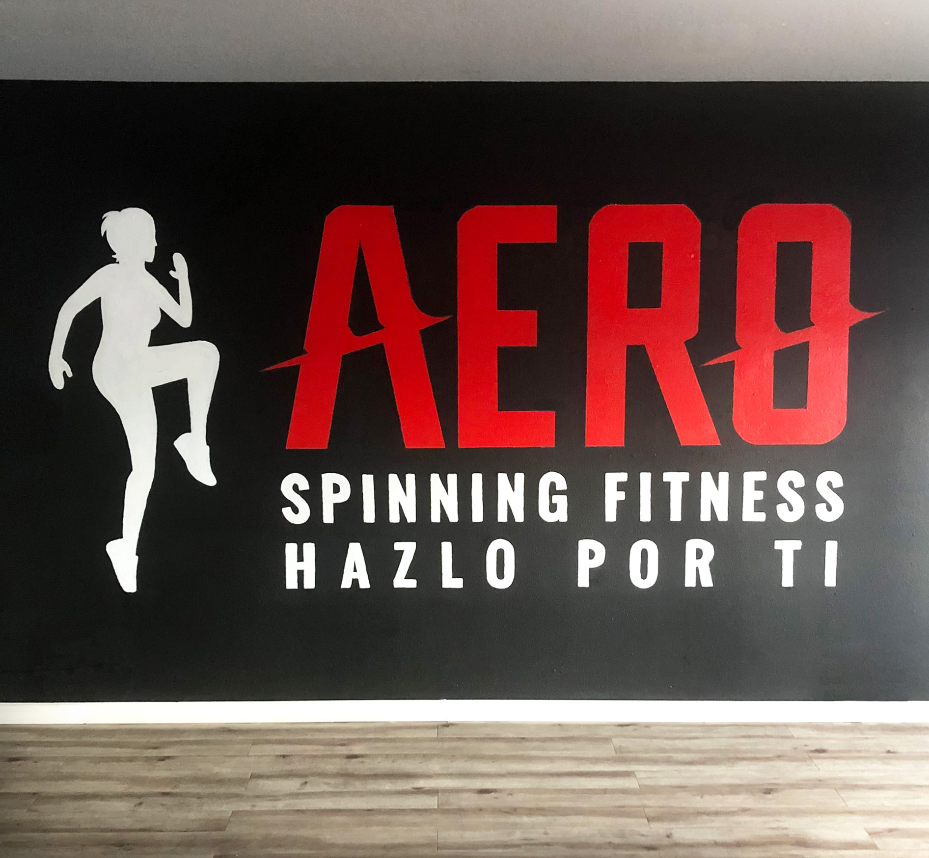
As a celebratory beginning, the logo was painted onto the gym's wall to kick off the brand with many proud lovers of wellness.

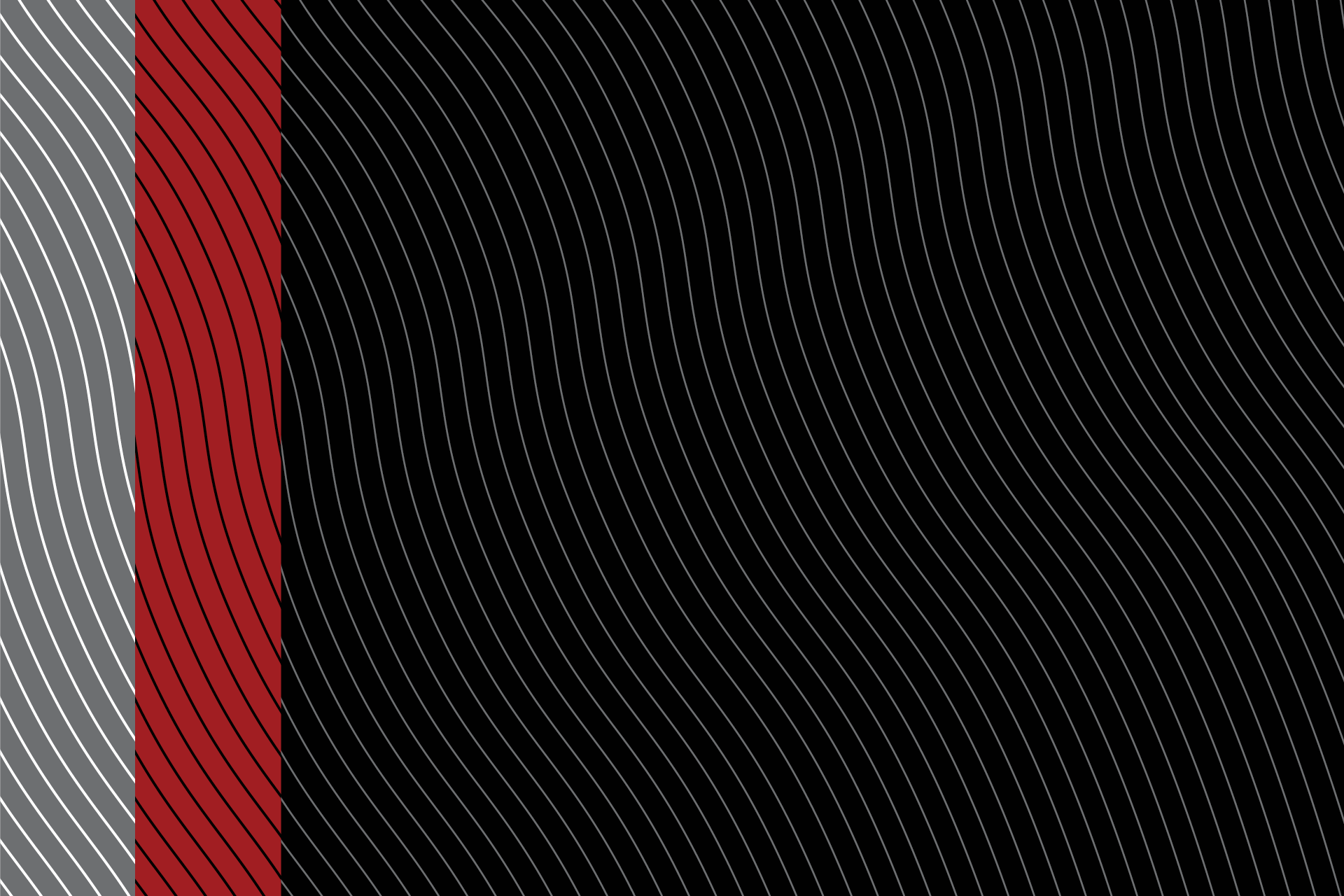
The brand’s pattern reflects one’s fingerprint, communicating the transformation that results from changing daily habits.

ROLE: LEAD DESIGNER
Done at Porque Creative alongside Ovidio Francisco-Juan and Project Manager Katia Vargas. A huge thank you to Landy for trusting us with taking her brand into a new direction.